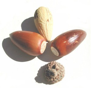
I mentioned the design workshop where we got a mystery item and have to use it as a starting point for a design, yes? Well, here's what I got: an elongated pod thingie, I think an acorn without its cap.

And remember how we were also challenged to use a color we find difficult? I'd selected olive green as my challenge color. Well, I spent about two weeks uninspired by the idea of brown and olive green. And, trying to escape being "tragically literal" (a phrase Jane Sassaman once used to describe someone and something I have to struggle not to be) I was determined not to make something about acorns.
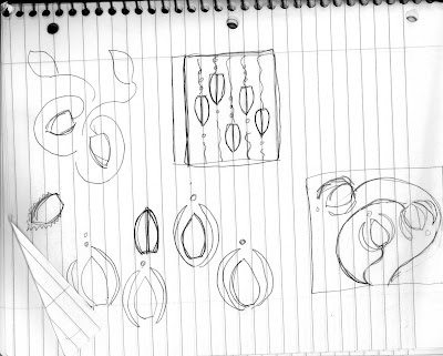
I doodled and doodled and was not inspired. I was trying to do something abstract with the shape without making it into "something" at all. But I couldn't seem to get anywhere.
Finally, several things occurred to me. First, I didn't have to use brown. (See what I mean about the tragically literal thing? While trying to avoid "acorn," I still got "brown" stuck in my head. Geez.) Second, I could use the green that's difficult for me and add another color. Hey, I know, how about PINK?
Suddenly, things felt fun. I doodled some more, and came up with this:

I know, not brilliant, but I did like that bud-like shape with the leafy thingies around them. I mean, that abstract ovoid shape with the abstract curvilinear shapes embracing them. Ahem.
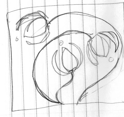
So after more equally talented (!) sketching, I came back to this and decided to work with it:

I was going to do tiny... maybe 10" by 10". But then, on the theory that a small thing is just as much work as a big thing, I went bigger... about 24x24 inches.
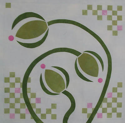
This doodle reminded me of an art nouveau design and Charles Rennie Mackintosh, whose Glasgow style of design is so pleasing to me. And that thought process led to this, which is on the wall right now:

That's a white background, by the way. My plan is to add some colored quilting (maybe some hand-stitching, even?) tomorrow. We'll see where it goes.
Hey, it's not brilliance. But as a response to this pod thingie, I'm happy with it. I've used the shape in a not too literal way (yes, I know, it's still fairly representational, but heck, it's a step in the right direction and since I came at it by not thinking "flower" but just playing with shapes, I'm gonna be content with that), and I've also captured the sense of curviness in this which sort (in my mind, anyway) relates to the smooth, curviness of the pod that I found so pleasing when I hold it.
Considering that I was starting to think about just avoiding the challenge as something that didn't inspire a response, I'm pleased that I kept at it and have ended up with something fun. I guess that's the biggest bonus of this design workshop: it takes me places I wouldn't go on my own.

WOW. I love what you've come up with. And I really enjoy seeing other people's sketches and design process - my sketches are quite - um - loose. Yep, that's a good word. They're loose.
ReplyDeleteI can really see the Mackintosh inspiration. There's a bedroom in Glasgow that your little quilt would look fabulous in -- all white with pink (and I think yellow) accents. Although the design is still representational, I do think it's obvious that you've stretched yourself going from the acorn to the "flowers." BTW, I love Mackintosh's designs so much I tried to convince my husband that we should name our daughter Rennie.
ReplyDeleteDianne, This is a wonderful piece. I love the colors and the shapes. And thank you for sharing your design process. The fact that the challenge got you to think outside your personal box means that it did it's job. Thinking outside the box is something I am currently working on. Cory
ReplyDeleteYou must be thrilled with your end result considering what you had to start with! Wish we had a workshop like that here ... we all need to think outside the box to see what creative juices we have inside ourselves. I enjoyed reading your thought and design process.
ReplyDeleteI love what you've done. It's perfectly charming and reminds me little if at all of the inspiration stuff.
ReplyDeleteThe checkerboard spots in the background is brilliant.. it that part of the Mackintosh inspiration?