Yesterday we revealed a new set of quilts over at the Twelve by Twelve blog. The theme was "chartreuse," and this piece above was my contribution. When I finished it, I was happy with it -- and yet, I have some ongoing ambivalence about it.
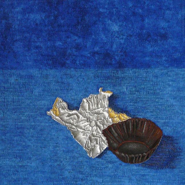
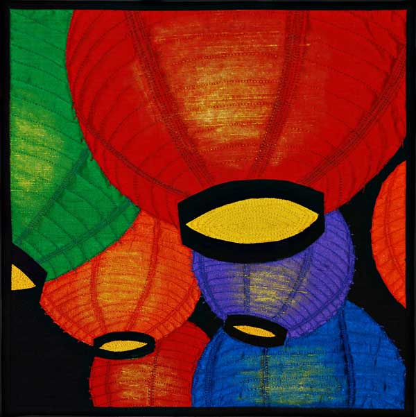
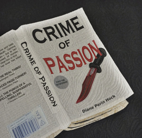
I think it comes down to my mixed feelings about using realistic images in my quilts. There's obviously something that draws me in that direction -- my literal mind, surely, but also a real pleasure in seeing something real depicted in fabric and thread. I love the work of artists like
Marcia Stein and
Velda Newman
It's a direction I've taken often in our 12x12 challenges. (
Here, and
here, and
here, for example.)
And, when I think about it, I enjoy developing the skill to translate an image into fabric and thread. I think it was my favorite part of working on this Wisteria piece, actually -- the process of really looking, and fine-tuning the values and contrasts, getting the highlights and shadows in there, finding and adding bits of subtle color. So all of that felt good and I really did have a grand time making this.
At the same time, I have a sort of "So what?" reaction. Perhaps the more realistic a piece is, the less appealing it is -- after all, why recreate a photograph when you have the photograph? In some ways -- aside from the technical aspects -- creating the most realistic interpretation may be the easiest route. Abstraction of an image -- capturing a sense of the image as well as the emotional tone and energy -- is a lot harder. It's what I love love love in the work of
Sue Benner and
Patty Hawkins. Ah, well, it's clear I've got a long way to go if that's what I'm aiming for. And, I suppose that's the question: what AM I aiming for?
In any event, that's not a question I can answer today. Instead, I'll show you a bit about how the wisteria leaves piece developed. I started with this base, hand-dyed green fabric fused to the lavender base.
From there, I started thread-sketching. I discovered that what looks good up close may look too bland from a distance. I'd add what seemed a dramatically contrasting thread -- say, red -- and then I'd step back and it would almost disappear. At one point, thinking I was nearing the end, I got to this point:
But when it was up on my wall for a bit, it just didn't have the punch of the original photo.
Too little contrast, too many medium to light values. Too much of the same color of green. So I went back in with more thread, and a bit of shading with my beloved Neocolor II crayons, to darken things up.
I suppose I could have fiddled with this for a lot longer, adding some blue here, some yellow there. But it was time to stop.
I'm going to try to make myself head in a more abstract direction next time. Oh, heck, it's all about having fun, right? So I'll do whatever appeals at the moment.


 , too!


 by Laura Joffe Numeroff: